
How to Turn Financial Reports Into Easy-to-Read Tables
I'll show you a quick way to turn long and complex financial reports into easy to read data table summaries.


Hi, it’s Diego.
I found out that a friend of mine is still reading raw quarterly reports.
Let’s be real for a second...quarterly earnings reports aren’t exactly light reading.
They’re long.
They’re packed with jargon.
And most people get lost after the second bullet point.
But here’s the thing: the numbers in those reports are pure gold...if you can actually make sense of them.
So here is EXACTLY what I told him... and it helped him out so much I decided to make it into a blog post.
This is where tables come in.
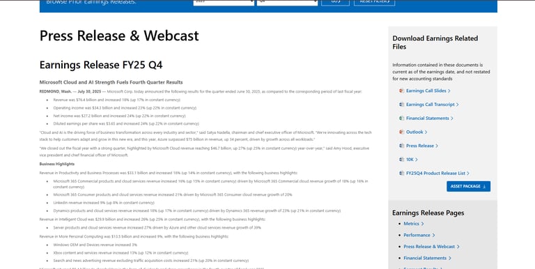
Take Microsoft’s Q4 2025 earnings release.
The press release looks like this:
Not bad, but you’ve got to dig through paragraphs and bullet points to pull out the key insights. Revenue? Buried in the first section. Cloud performance? A few bullet points down. Year-over-year growth? Scattered everywhere. It’s not exactly designed for someone who wants to understand the big picture in 30 seconds.
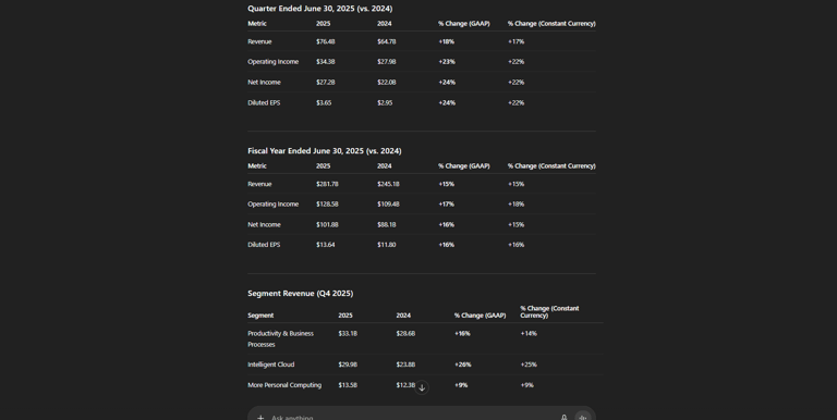
Now compare that to this:
Same data. Different format.
Instead of paragraphs, you’ve got metrics lined up side by side: revenue, operating income, net income, EPS. Each compared against last year, with the percentage change clearly listed.
See the difference? You can scan it in seconds.
Tables aren’t just prettier. They actually make data useful. You get clarity, because revenue, income, and EPS are all right there. You get comparison, because year-over-year growth is obvious when the numbers sit next to each other. You get segmentation, because you can break out results by business unit like Cloud, Productivity, or Devices. And most importantly, you get speed—whether you’re an investor, journalist, or business owner, you get to the point fast.
It’s the difference between trying to decode a novel and scanning a scoreboard.
When you present financial data in a structured table format, you don’t just make it easier to read...you make yourself look sharper. Whether it’s for a blog post, a presentation, or a client report, structured tables instantly elevate your message.
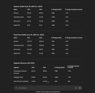
Just look at this quick breakdown
All you do is copy and paste the report into ChatGPT and ask for a summary using data tables.
That's it.
So next time you’re working with financial data—quarterly earnings, KPIs, even your own business numbers...don’t just copy-paste bullet points. Turn them into a table.
Because numbers aren’t powerful until people understand them. And the fastest way to get people to understand? Structure the data.
Talk soon,
Diego
PS: If you are in finance and you want to learn even cooler tricks... click below to get a free consultation and we will show you everything AI can do for you!
Let’s turn AI into your competitive advantage
All you have to do is fill out a quick form and we will take care of the rest.
